
Palapa App
Overview
Palapa.ai is an AI startup dedicated to democratizing artificial intelligence through its no-code platform. The purpose of Palapa is to empower users to effortlessly create and deploy their own AI assistants via an iOS mobile app, without requiring programming skills. This initiative makes advanced AI technology accessible to a diverse user base, including tech enthusiasts, small business owners, educators, and hobbyists. I was responsible for the UI/UX design of the application.
Timeline
Jul 2022 - Aug 2023
My Role
UX/UI Designer
Collaboration
1 Team of SWEs
Tools
Figma, Asana, Slack
Problem
Initially developed by a programmer without extensive design expertise, the Palapa app needed more intuitive navigation, consistent visual design, and a steep learning curve. These issues could have improved the user experience, making it easier for users to create and manage their AI assistants efficiently.
Goal
Enhance Usability
Simplify the user interface and streamline the user experience to make AI creation more accessible.
Improve Design Consistency
The current app lacks a consistent visual style and a design library. Developing a cohesive set of components and assets will create a unified visual identity, enhancing the app’s visual appeal and navigation ease.
Optimize User Guidance
Provide clear, intuitive guidance throughout the AI creation process to reduce user frustration and improve efficiency.
Solution
Through the UI/UX redesign of the Palapa app, I focused on improving user experience and operational efficiency. By simplifying navigation and establishing visual consistency, I ensured a more intuitive pathway for users to create and manage AI assistants. Iterative prototyping allowed continuous user feedback integration, refining the design to meet diverse user needs better. These enhancements collectively transformed the Palapa app into a more user-friendly and effective tool, laying a robust foundation for future scalability and innovation within Palapa’s no-code AI platform.
01 Research
User Research
We conducted semi-structured interviews with 5 users to gather insights on their current app usage and identify key pain points they encounter. These interviews provided valuable perspectives that informed our understanding of user needs and guided the direction of the UX redesign for Palapa.

Competitive Analysis

Analyzing the Current System
A user flow was developed to analyze the app’s current navigation, with red annotations identifying areas for improvement to streamline processes and enhance user guidance.

A sitemap was developed to analyze Palapa's current structure, guiding the redesign to create a more intuitive and organized layout for better user navigation and efficiency.

Understanding the business requirements
I met with Palapa’s stakeholders to understand what they’re trying to achieve and design assumptions they may have. We used Milanote to help define the current problems, business goals, target audience, and value propositions.

02 Define
User Persona

Revised Sitemap
Following an analysis of Palapa's user flow, sitemap, and user research, we reorganized the navigation to meet user needs better. This restructuring simplified access to key features, enhanced the overall user experience, and provided a more intuitive flow throughout the app.

03 Design

Early Ideation
The design process began with brainstorming and sketching sessions to visualize the app’s layout and key functionalities.
Design System
Next, I developed the typography, color scheme, and UI components to ensure consistency and brand alignment.

Low Fidelity Wireframes
I translated the initial ideas into low-fidelity wireframes and shared them with Palapa stakeholders for feedback.

High Fidelity Wireframes
I incorporated the feedback, refined the wireframes, and created a more polished and detailed design.

04 Testing
User Testing
The testing phase aimed to assess Palapa's redesigned interface for usability among 7 participants unfamiliar with the app. Objectives included identifying usability issues, validating design decisions, and ensuring interface clarity and intuitiveness. Participants performed tasks like creating and using AI assistants. This allowed us to observe how new users navigated the interface and completed tasks effectively.

05 Final Designs
Before and After
Palapa's app previously had an inconsistent design with a cluttered color palette and lacked a unified visual style. The absence of a design library resulted in a disjointed user experience, making navigation and interaction confusing.
Here's a detailed walkthrough of what I improved post-testing.
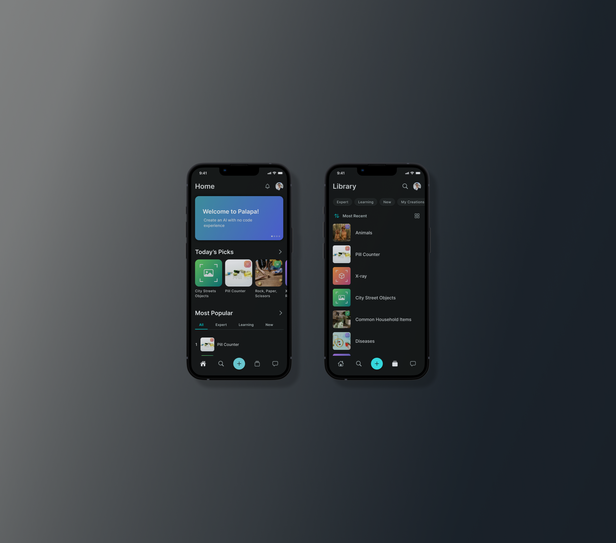
Home Page
The app initially featured a single-page layout, which limited user access to features and content.
The redesign introduces a navigation bar with multiple pages, allowing users to easily access different features and sections of the app.

AI Profile
Before the redesign, the page had cluttered content and clashing colors, hindering user navigation.
I reorganized the layout for a cleaner, intuitive interface, and introduced new features based on stakeholder discussions: users can now add pictures to AI profiles, engage in community discussions via a social feature, and contact AI admins directly.

Create AI
The original process lacked clear guidance during AI creation, making it difficult for users to navigate.
To solve this, I implemented a step-by-step guide that provides intuitive direction and clarifies the next steps. This enhancement aims to make the AI creation process more straightforward and user-friendly.

06 Takeaways
Measuring Success
Although the redesigned Palapa app is still currently in development, several methods have been implemented to predict and ensure its success:
Prototype Testing: Usability tests with low and high-fidelity prototypes involved 10 participants, achieving a 75% task completion rate with an average time of 2 minutes per task. Initial feedback indicated an 85% user satisfaction rate.
User Feedback: Qualitative feedback from interviews and surveys with 15 potential users showed 80% found the new design more intuitive, and 90% had clear expectations for the final product.
Success Metrics Definition: Defined success metrics include targeting a 90% user satisfaction rate, aiming for a 50% increase in user engagement, and expecting a 30% higher task completion rate post-launch.
What I learned
Working with Palapa was a valuable learning experience. I deepened my knowledge of design systems, mastered tools like Figma, and refined my communication skills with users and stakeholders to achieve project alignment. I gained insight into balancing aesthetic appeal with functional efficacy, prioritizing usability and empathy to deliver impactful user experiences.
07 Next Steps
Here are some next steps for Palapa
Iterate and Expand User Base
Continuously refine the app interface to improve usability and attract a wider user base. Through ongoing user testing and feedback, optimize features to meet the needs of the growing community.
Develop New Features
Prioritize the development and design of planned features for Palapa's app. Conduct thorough research and user testing to ensure these new features meet user needs and enhance the app's capabilities.
Redesign Website
Update Palapa's current website to align with the new design system and ensure consistent branding.
Introduce Web Version
Design and launch a web version of Palapa to broaden accessibility and usability. Tailor features and interface based on user research to optimize engagement and functionality